FACILITATION / RESEARCH / ANALYTICS
Building a Website Through Fast-Paced Workshops
Intentional strategizing, despite limited time and budget
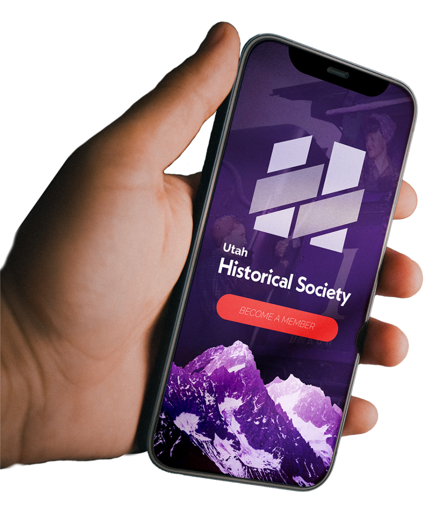
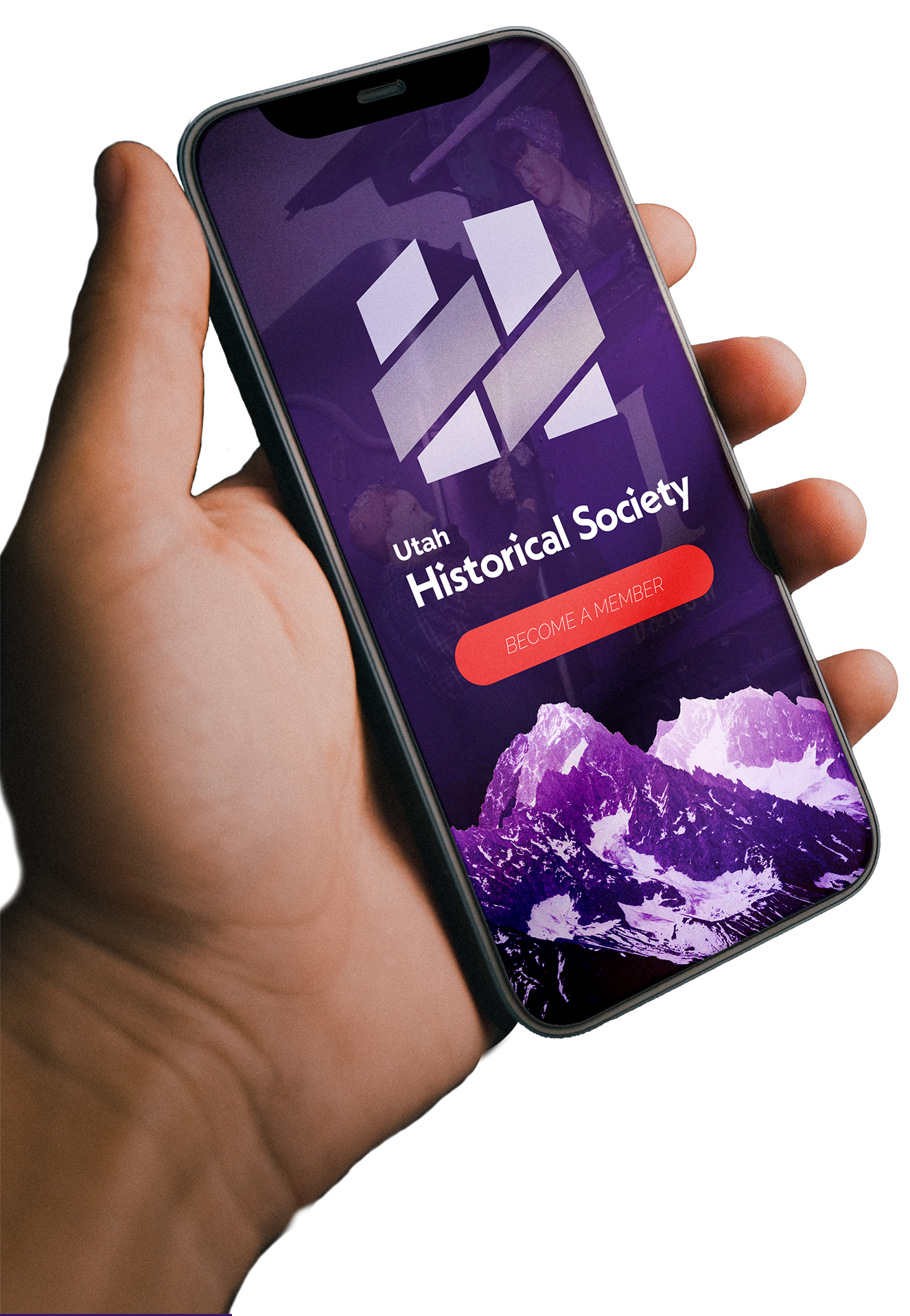
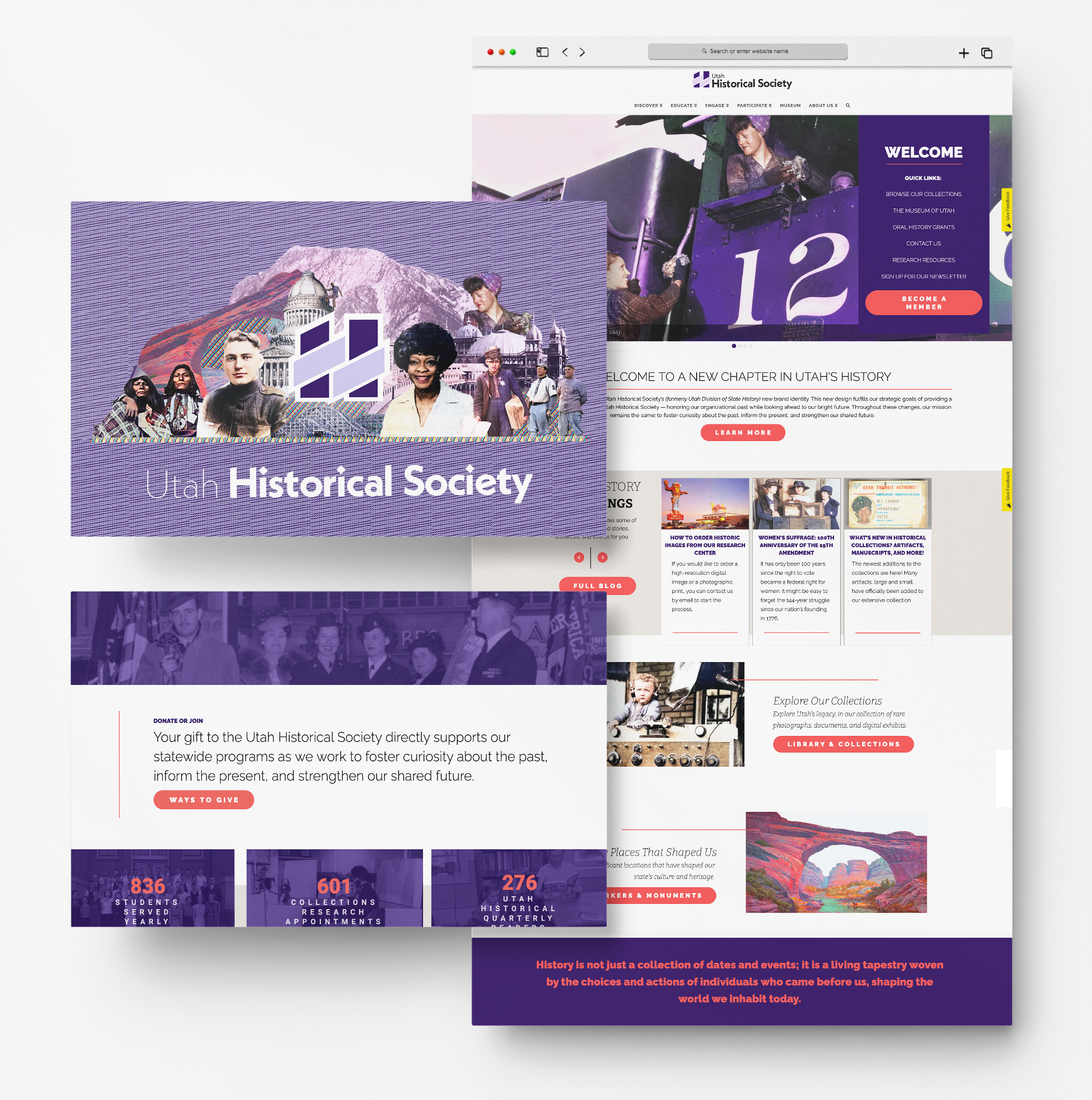
The Utah Historical Society (UHS) is a venerable institution committed to preserving Utah’s rich legacy. Their original website was created over two decades ago, and was in desperate need of rebuilding. In collaboration with the UHS staff, my team and I created a modern, user-centric redesign for their website.
OVERVIEW
Our team created a new UHS website to enhance its user experience, via the implementation of effective content, data tracking, and accessibility standards.
Our goal was to increase donations, memberships, and membership retention. By rebuilding the website’s design, content, and user pathways, we aimed to better communicate UHS’s exclusive member programs and benefits.
MY ROLE
As the Project Manager, my task was to work with the UHS staff to understand the website’s key issues, create a wide array of templates to address those issues, and train the staff on how to update their pages in the future. Ultimately, it was my aim to streamline a frictionless user experience, while delivering on time and within budget.
THE TEAM
Our interdisciplinary team was comprised of a creative director, a newly-hired web master, and a long-time UHS staff member.
Working in synergy with UHS staff and the Department of Technology Services, our team reported our findings, recommendations, and progress to the department head.
OTHER STAFF
We conducted workshops with seven different UHS Program Managers, with a goal of creating new web pages that represented their respective programs. We also provided comprehensive training for the staff to show them simple processes for updating their pages in the future.
OUR APPROACH
Decisions were made quickly but concisely, in order to act strategically despite limited time and budget.
In a series of ten separate hour-long workshops with each respective Program Manager, we developed a charming, modern brand, synthesizing target groups for membership, and meeting division goals.
These workshops allowed us to work extensively with each Program Manager, developing comprehensive solutions to address the needs of their program. Each Program Manager needed to be able to easily monitor and update their pages.
As we only had one 18-week iteration to complete this large project, it was important that each project member clearly understood their role and the department requirements. To that end, I set up a UHS Program Manager-Designer relationship, where one staff member could hand off questions, critiques, and results to their assigned designer ASAP, and work in tandem when appropriate.
My approach relies on Design Thinking, in order to better understand the mental model of our users. This enhances our ideation of new solutions that can be tested to determine whether or not they were the best possible option for the overall user experience.
Conduct research to develop an understanding of our users.
Combine all our research and observe where problems exist.
Generate a range of crazy ideas that might solve the problem.
Build a real representation to express our ideation.
Ask the experts again: user testing for feedback on our ideation.
Deliver the new solution in place and monitor using analytics.
TARGET MARKET
We created three detailed user personas in order to better understand our target market:
USER PERSONA 1
Historical Enthusiast - "Emma"
Background:
Emma is a 40-year-old history teacher, deeply passionate about Utah’s rich cultural heritage.
She holds a master’s degree in history and actively seeks ways to enhance her knowledge.
Goals and Needs:
Emma is looking for well-researched and engaging content to supplement her teaching material.
She seeks access to in-depth historical archives, scholarly articles, and research resources to stay updated on the latest research.
Emma values a user-friendly interface that allows her to navigate through various historical periods seamlessly.
Expectations from the Website:
- Access to in-depth research materials, historical documents, and academic publications.
- Regular updates on historical events, exhibitions, and educational programs.
- User-friendly navigation with a focus on academic rigor.
USER PERSONA 2
Community Builder - "Carlos"
Background:
Carlos, a 55-year-old community leader, is invested in strengthening bonds within his rural Utah town.
He has a background in community development and is an advocate for preserving local traditions.
Goals and Needs:
Carlos wants resources that can help him showcase the historical significance of his town.
He seeks collaboration opportunities with the Utah Historical Society to organize local events.
Carlos is interested in accessible, community-focused content that can engage a diverse audience.
Expectations from the Website:
- Information on community-oriented programs and initiatives by the Utah Historical Society.
- Resources for organizing local historical events and preserving community heritage.
- Easy-to-share content to engage and educate diverse community members.
USER PERSONA 3
Curious Student - "Olivia"
Background:
Olivia, a 17-year-old high school student, has a budding interest in history and wants to explore her Utah roots.
She enjoys interactive and visually appealing content that makes learning enjoyable.
Goals and Needs:
Olivia is looking for a website that can provide accessible and engaging historical content.
She wants to participate in educational programs that cater to her age group.
Olivia is interested in visually rich content that brings history to life.
Expectations from the Website:
- Interactive learning modules and multimedia content for a dynamic learning experience.
- Information on youth-centric events, internships, or educational programs.
- A visually appealing and easy-to-navigate platform to encourage exploration.
HOW THE UTAH HISTORICAL SOCIETY CAN ENGAGE THESE PERSONAS
- Implement a dedicated section for educators like Emma, offering teaching resources and lesson plans.
- Create a community engagement portal for individuals like Carlos, encouraging local partnerships and event planning.
- Develop interactive and visually appealing content for students like Olivia, fostering a love for history through multimedia experiences.
TIMELINE
18 Week Plan
Sprint 1: Research & Planning (Weeks 1-3)
- Week 1: Conducted project manager interviews, user surveys, and scheduled in-depth workshops in order to understand pain points.
- Week 2: Analyzed existing data and metrics.
- Week 3: Developed user personas and journey maps.
Sprint 2: Ideation & Prototyping (Weeks 4-7)
- Week 4: Brainstormed sessions for feature improvements.
- Week 5: Developed low-fidelity prototypes.
- Week 6: Conducted usability tests on prototypes.
Sprint 3: Development – Iteration 1 (Weeks 8-9)
- Week 7: DTS front-end development team implemented frontend improvements for speed.
- Week 8: DTS back-end development team optimized for search functionalities.
- Week 9: Entire DTS development team Initial implementation of customization features
Sprint 4: Testing & Feedback – Iteration 1 (Weeks 10-12)
- Week 10: Conducted A/B tests with the pilot group for speed improvements.
- Week 11: Collected user feedback on search functionalities.
- Week 12: Analyzed data and prepared for the next iteration.
Sprint 5: Development – Iteration 2 (Weeks 13-15)
- Week 13: The development team refined the front-end based on feedback.
- Week 14: The development team optimized the back-end based on analytics.
- Week 15: Finalized customization features.
Sprint 6: Testing & Launch (Weeks 16-18)
- Week 16: UX conducted the final round of A/B tests and user feedback.
- Week 17: Made last-minute adjustments and code freeze.
- Week 18: Prepared for launch, ensured that implementation process was understood by Program Managers and web master, and completed documentation.
TOP 5 RESEARCH-BASED RECOMMENDATIONS
By utilizing both moderated and unmoderated user testing, coupled with input from the analytics team, we were able to discover the points in the user journey that caused the most friction and make recommendations for ideation from there:
1
SIMPLIFIED SIGN UP
Potential members might find the sign-up and donation processes cumbersome. Simplifying this process with a clear and intuitive user interface will provide straightforward information about membership levels, benefits, and associated costs. Incorporating a progress tracker during the sign-up process will also help to keep users engaged.
2
SHOWCASE IMPACT
Visitors may not fully grasp the impact of their support. Incorporating compelling storytelling through case studies, success stories, and testimonials will showcase how donations and memberships have contributed to preserving Utah’s history, fostering education, and strengthening communities. Using multimedia elements like videos and interactive timelines will make the impact tangible.
3
HIGHLIGHT BENEFITS
The exclusive benefits for members in programs need to be prominently featured. Create a dedicated section or landing page for exclusive member programs. Using engaging visuals, concise descriptions, and direct calls-to-action will encourage participation. Ensure that the value of each program is clearly communicated.
4
IMPLEMENT TEMPLATES
Implementing web page templates will offer a strategic and user-friendly solution for staffers, allowing them to update content and monitor important data. These templates will maintain a consistent and visually appealing layout, ensuring uniformity across the site while making it easy for staff to insert new content, images, and updates without technical challenges.
5
RESPONSIVE DESIGN
These improvements should be complemented by a responsive design, ensuring that the website is accessible and user-friendly across various devices. Making regular updates to the content will keep it fresh and engaging. Additionally, leveraging social media platforms will help to promote the website content and encourage community engagement.
WIREFRAMING
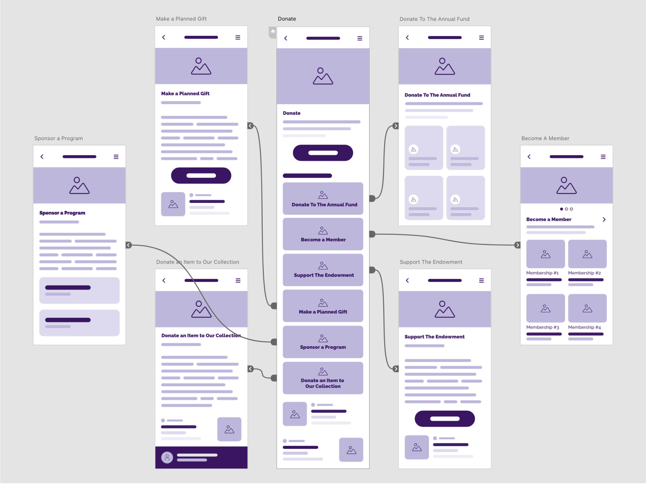
By presenting a clear visual roadmap of the donation options, we empowered users with a sense of transparency and intuitive understanding.
A well-structured wireframe not only streamlines the donation process but also elucidates the benefits of becoming a member, fostering a user-friendly environment. This clarity instills confidence and satisfaction in visitors, prompting them to engage more willingly and contribute generously. After all, a website that effortlessly communicates its purpose and offerings is far more likely to inspire users to contribute.
SOLVING OTHER KEY ISSUES
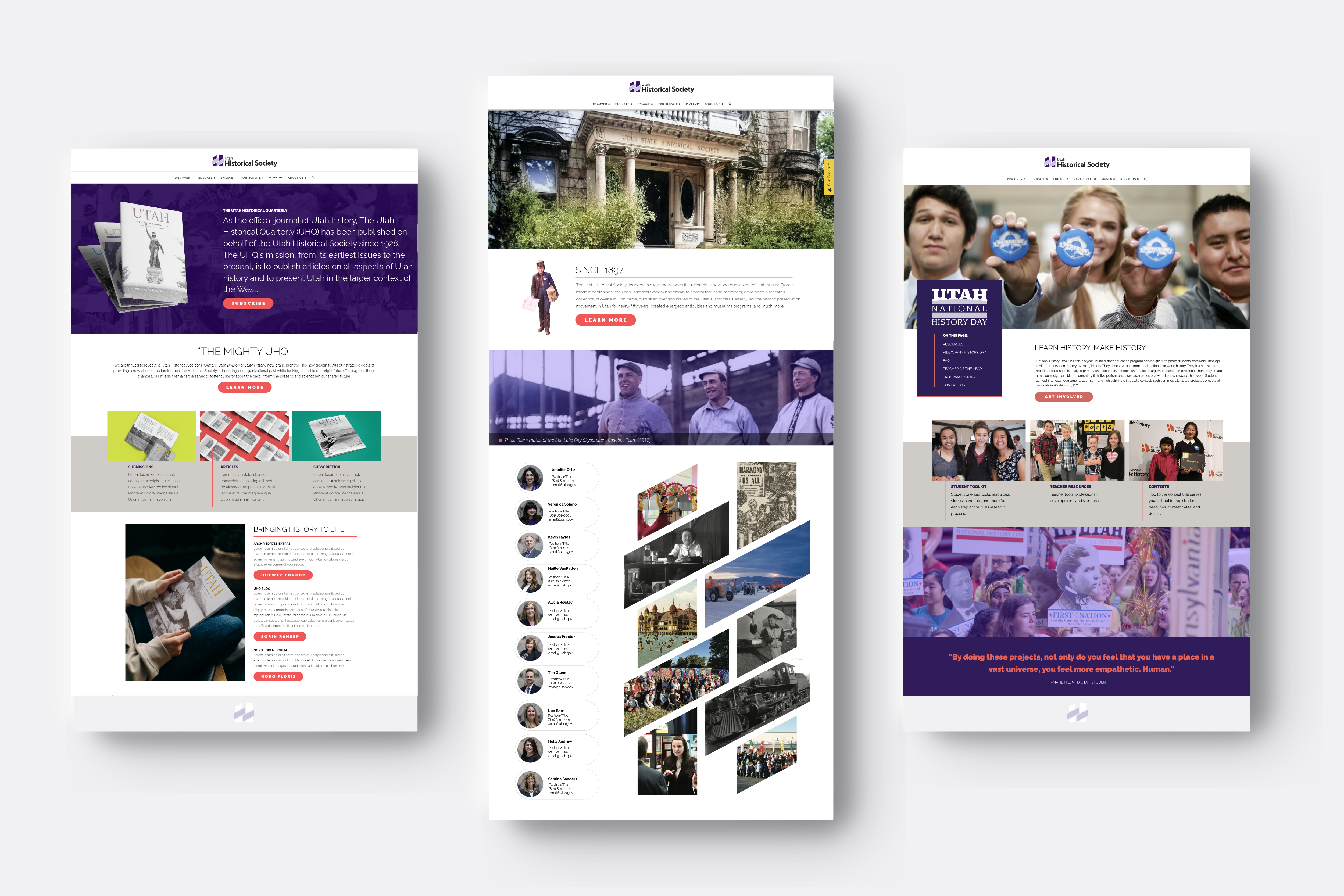
Beyond our donation research, there were a number of best-practices that we implemented. These solutions addressed a number of issues, ranging from aesthetics to functionality.
Lack of Clarity
Prioritize Clarity
Accessibility
A Website for All
Complex Navigation
Simplify Complexities
Missing SEO Opportunities
SEO Strategizing
Volunteer Interest
Feature Opportunities
Trust Deficit
Build Trust
RESULTS
The Utah Historical Society's website redesign and optimization journey was a testament to the power of user-centric design. By understanding user behavior and addressing their needs, we transformed the website into a vibrant hub of Utah's legacy, which successfully increased memberships and engagement.
The redesign not only aligned with UHS’s strategic goals but also enriched the user experience and strengthened the staff’s confidence in their online presence. Moving forward, a data-driven approach will guide UHS’s website evolution, ensuring a dynamic and impactful digital presence.


